
“You could push this across the finish line, or tow it.”
“You couldn’t even tow that across the finish line.”
We all like things that go fast. The moral of the Hare & the Tortoise isn’t to go slow and steady, it’s to put the work in and don’t fall asleep at the wheel. So let’s put that work in and see how we can work on optimizing our sites.
This article will go over some relatively easy things you can do that will have a big impact on your page load times, as well as a deeper dive into some of the nuances of how browsers work that can make or break a fast site. The “What are some easy wins?” are things that can be done by the average user and developers alike, while “Optimizing for Speed” will be better suited for developers with the access and ability to make coding changes.
Why Going Fast is so Important

I shouldn’t need to explain why people prefer sites that load fast over sites that load slow. So I won’t. Instead, let’s look at real world reasons why it is so important to optimize your site as best as you can for page speed.
The first major reason is SEO (search engine optimization) and Google. Things that are good for your users, are good for SEO. Search engines actively penalize slow sites as they provide a worse user experience. And that’s pretty much the core of the argument; if it’s good for your users, it’s good for you.
To dip into the user experience well again, Walmart noted that with every second of increased page speed, they saw a two percent increase in conversion. A study by skilled.co saw that:
- Pages that loaded in 2.4 seconds had a 1.9% conversion rate
- At 3.3 seconds, conversion rate was 1.5%
- At 4.2 seconds, conversion rate was less than 1%
- At 5.7+ seconds, conversion rate was 0.6%
Basically, by not speeding up your site, you could quite literally be losing out on sales and leads.
How are we measuring speed? What is the end goal?
For this article, the best tool to use is Chrome’s Lighthouse, which can be found in most Chromium based browsers (Google Chrome, Edge, Vivaldi, etc), and it is a great tool because it can be run directly within your browser and is a great representation on how Google themselves view and rank your site speed.
To run, navigate to the page and select F12. Then select the Lighthouse tab. From here, select Performance under Categories, and choose Mobile as your Device. We care mostly about mobile because A) Google switched to a mobile-first indexing, B) Most users are mobile, C) Mobile is hardest to optimize for, so getting a good score here almost guarantees a great score for desktop.
You can also run Google’s PageSpeed Insights if you refuse to use a Chromium based browser.
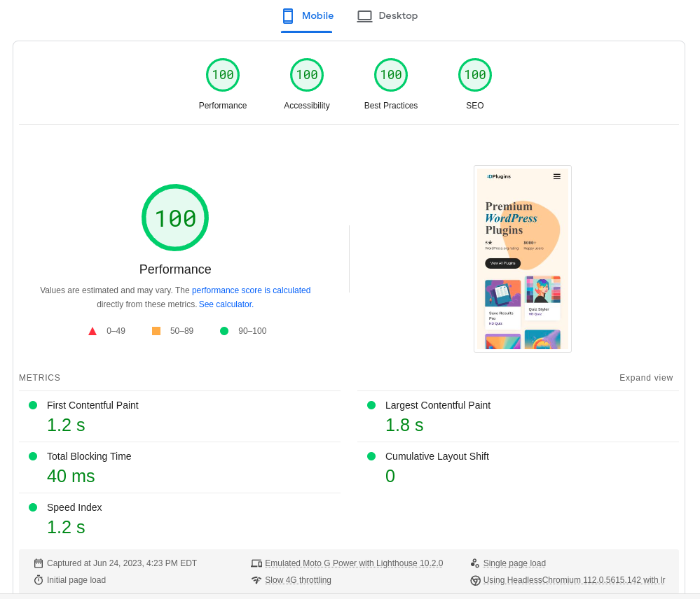
Important terms / metrics
Performance Score
This is the main/final score that Lighthouse shows to represent how fast your page is overall. It’s important to note that it is essentially using a logarithmic scale, meaning that going from a score of 10 to 30 is super easy. But going from 95 to 96 is super hard.
First Contentful Paint
This represents how long it takes for your browser to get all of the data it needs and display some content. Displaying an empty div does not count – the content needs to be an image or text.
Largest Contentful Paint
Your browser will probably have to do several “paints” to be able to render the final result, but this metric basically represents how long it took to display everything “above the fold” ← the content that is first visible before scrolling.
Total Blocking Time
How much time was taken by “render blocking elements”. A blocking element is a script or style that needs to load in and render before other content can do so.
Cumulative Layout Shift
Websites literally render from top to down based on the HTML source code. But with the power of CSS, we can reposition elements. The CLS metric measures how much time the browser had to spend repositioning everything.
Time to Interactive
This metric has mostly been rolled into the Total Block Time metric, but if you see this, it means how long it took the page to become interactive. An example would be of the page renders quickly, but due to layout shifts or some heavy JavaScript, despite the page being visible, a user can’t click on things or scroll yet.
What are some easy wins?

Let’s now start with some basic and easy things that almost anyone can do on any site to see some immediate improvements to the above metrics. Starting with…
Properly size images
File size matters. A site that only needs to download 100kb of data will load faster than a site that needs to download 5000kb. One of the most common culprits of large downloads are images. So what can you do to help?
Reduce the image dimensions
Let’s say, for example, that the maximum width of the content on your site is 800px wide. If this is the case, why are you loading an image that is 2000px wide? Resize your images to fit the maximum size of your content. If you do not have Photoshop or any other image editing tool, I can heartily recommend Photopea, a free image editor in your browser.
As a side note, the resolution (DPI) of your images should be 72. A DPI of 300 is common for print, but generally speaking is FAR more than is needed for digital assets.
If you are using WordPress, instead of printing the image yourself, use get_the_post_thumbnail to print the image instead so that you can easily get srcset. If you don’t know what srcset is, it basically allows you to have multiple copies of the same image, but at different sizes. The advantage being that your browser can automatically download the size that best fits your screen.
Use correct file type and quality
I’m sure you’ve seen the different image file types before. GIF, JPG, PNG, etc. But not all file types are created equally, and each have their places. GIF for example, is a pretty terrible file type in terms of size and render performance, but has the advantage of allowing for low quality animated renders. PNG is pretty good for visual quality, and allows for transparency, but is also a poor choice for file size.
WebP, however, is just about the perfect choice across the board. It has fantastic rendering performance (time it takes to actually display an image), low file size, and high quality. The problem is that it can be difficult to add to your site, even with the help of plugins (WebP Express seems to work well if you are OK with configuring it).
Which is why for this article, I am going to recommend JPG for all images that do not require a transparent background, and PNG for the ones that do. You can then either reduce the saved quality yourself in Photoshop/photopea, or use a third party service like TinyPNG. I think you’ll be surprised at how much you can reduce the file size of your images without compromising on quality.
HTTP/2 and CDNs
You know how every website starts with http? That’s because http is the protocol that we use to allow your browser to communicate with the web server. But it’s not perfect. The following is an oversimplification, but it should be good enough to get the point across.
With HTTP, things download one by one, in order of first appearing in the HTML to last. So if you have a script or stylesheet in your header, those need to download before the images in your content, before anything else in your footer.
The exception to this rule is if the content is on a different domain. Once again, this is an oversimplification, but lets for example imagine that your browser is only allowed to open up one “connection” per domain. So if all of your assets are on your one domain, and all assets need to download one by one – well that’s slow! But what if you put some of your assets, like images, on a different domain? Well now your browser can open up two connections! This is the idea behind a CDN.
A CDN is a Content Delivery Network, and is a service that will host some of your assets on a different domain. You can set up your own CDN-like system by simply hosting your images on a subdomain. Or you can use a dedicated CDN provider like Cloudflare.
Most servers, especially older ones, still utilize good old HTTP. But what if I told you that there is another. Bigger, better, stronger. HTTP/2 (and also HTTP/3, but that isn’t quite ready for mainstream yet).
With HTTP/2, your browser now unlocks the ability to have better parallel downloads from the same domain, greatly speeding up that initial download time. In order to utilize HTTP/2 it will need to be setup and enabled on your server, but using Cloudflare DNS will also allow you to use HTTP/2 as well.
Dangers of lazy loading images
Lazy loading images is a SUPER cool feature now available in all modern browsers. The idea behind it is to only waste time downloading and rendering images once they enter the viewport.
So, for example, if you have a bunch of images way down on the bottom of your page, then let’s not waste time downloading them until the user scrolls far enough down the page. This can significantly increase initial page load times. But improperly using can cause more harm than good.
Why does this sometimes increase load times? The dangers of lazy loading only become apparent when you have an image “above the fold” – in the viewport on page load. The simplest way I can put it is that when not lazy loading, the image downloads and thus renders at the time of that first content paint.
But when lazy loading, the entire page loads and renders first, and then your browser goes “oh, there is supposed to be an image here“, so it then fetches and renders the image.
This is especially bad because it causes almost an entire repaint to occur since the page was initially loaded without an image, but now that the image has popped in, it changes the position of all the elements below it, making the browser have to figure out where everything is supposed to be all over again.
To see how much of a difference this one thing can make, I ran a test on the learn page of HDPlugins. I turned off all caching, so these numbers are lower than real-world, but this is good enough to show the difference.
With lazy loading enabled on all images on the page, I got a mobile score of 87, and also a warning message of “Largest Contentful Paint image was lazily loaded”.
By running the test again, but this time setting loading to “eager” (IE: Disable lazy loading), I got a score of 93! That is an absolutely MASSIVE difference.


So what’s going on here? Basically, the extra time caused by the browser needing to redo work (and recalculate/reposition everything below the first image) took far more time than just loading the images directly. Of course, this is on my site where the images themselves are already properly sized webp’s, so if you are too lazy to properly resize your images, lazy loading everything might end up being the better option for you, you lazy, lazy hare.
In order to get the BEST performance, you’d want to make sure you are NOT lazy loading any images that appear “above the fold”, but DO lazy load images below. This way you get the best of both worlds.
GZIP Compression
If your server is compatible with it (and just about every server should be), enable GZIP compression. Kind of like how you can zip files up so that they take up less space, GZIP likewise uses an algorithm to compress data – and it can have a fairly significant impact on how much data needs to be downloaded.
You will need to look up a tutorial for your specific server/hosting environment, but if you are using cPANEL, then here is a quick tutorial for you.
Log into your cPANEL account, and then look for something similar to “Optimize Website”. This might be labelled differently depending on your host, but you can use the search bar to make finding a little easier. From this page, make sure “Compress All Content” is enabled.
Now your host is set up to use GZIP, but you still need your site to utilize it too. To do this, edit your .htaccess file (MAKE SURE TO BACKUP THIS FILE FIRST), and add the following to the top.
<IfModule mod_headers.c>
<FilesMatch ".(js|css|xml|gz|html)$">
Header append Vary: Accept-Encoding
</FilesMatch>
</IfModule>
If you cannot find the .htaccess file, make sure you have “Show Hidden Files (dotfiles)” enabled in your File Manager settings.
Use Page Caching
If your host is compatible with LiteSpeed – use that! If it isn’t, or it is too complicated to set up, then I can whole heartily recommend using the WP Fastest Cache plugin for WordPress.
Kids are funny. If you tell a kid that the square root of 81 is 9, they will go around asking everyone in the room, proudly parroting that the answer is 9. But the key word there is parroting. The child isn’t doing math each time to get to the answer of 9. No, they are smarter than that and instead just remembers.
Don’t be a dumb adult, be a child.
Databases are slow, especially on lower quality/cheaper hosts (cough *godaddy*). Having your site constantly need to do expensive database queries to figure out what content is supposed to be displayed on this page is not only wasteful, it’s slow. This is where page caching comes in. With page caching, instead of recalculating everything every time a page loads, we calculate it once and then remember.
Intermission

We’ve already covered a lot, and I hope that you’ve learned something so far that can help you reduce page load times. So far, most of the things covered can be implemented by most site owners across different platforms like WordPress, Joomla, Shopify, or even just your static HTML/CSS site.
Most of the following sections will be more geared towards developers who want a deeper dive and are more likely to have both the access and capabilities to apply the lessons. But if you’ve made it this far, I just want to say THANK YOU for taking the time to read this weirdo’s digital ramblings, and please don’t hesitate to leave a comment if you need advice or have any questions.
Optimizing for Speed
So far, for the most part, everything gone over in this article is doable by the average user without needing (in most cases) to edit the code or design of your site. This is where the waters turn muddy and you may need to either make coding changes yourself, or hire someone to do it for you. So lets start with something that you at least have some control over.
Plugins, Themes, Libraries, and Frameworks
This is a tough one to talk about, because in a lot of cases, it’s out of your control. So lets start with how to make the best choices from the start.
jQuery, React, Bootstrap, etc
If you are a developer and are creating something, avoid unnecessary libraries. No, you probably don’t need to use jQuery. No, you probably don’t need to use React. Bootstrap? Are you crazy? Get that library out-a-here.
To hearken back to the file size argument, having to download an entire JS library is always going to slow things down. Not only that, but there is (for this article at least) a concept called “cold boot”. If you import jQuery, and then use jQuery to, for example, toggle an element, here is an example of what is actually happening.
- Your browser needs to download jQuery
- Your browser needs to load jQuery
- Your browser needs to download your own code
- Your browser needs to load your code
- Your code then uses jQuery to toggle an element
That is dumb. Here is what happens if you toggle an element with using native/vanilla JavaScript.
- Your browser downloads your code
- Your code toggles the element
You know those “render blocking” errors you keep seeing in Lighthouse? A lot of the time they could be eliminated by not having to use a library, since by definition, your code cannot execute until the library has downloaded and loaded into the browser.
Now, to be clear, libraries have their place! HD Quiz still uses jQuery for some things simply because it’s a lot easier to do with jQuery than to do with vanillaJS. It’s 100% OK to use the best tool for the job. But when talking about performance, speed, and optimization, you need to seriously consider the extra weight that libraries bring.
Only load when needed
Let’s use this site and page as an example. HDPlugins is a full eCommerce website with login, memberships, a fully featured support forum, and a custom commenting system. However, if you take a look at the source code of this page, you will not see ANY scripts related to either the forum or eCommerce – because this page doesn’t need it.
One of the things I see all the time that DRIVES ME CRAZY, is inefficient WordPress plugins that load their assets on every page, regardless of the context. *Notable examples are WooCommerce and Contact Form 7.
*No shade at these plugins. They are both very old and well established and essentially need to work they way they do because if they change anything too drastic, it could potentially break a lot of people’s sites if the sites are old and doing weird things.
Contact Form 7 loads its stylesheet and JavaScript on all pages, even if the page doesn’t have a form on it. That means that all of those styles and functions need to be downloaded and parsed – for no reason.
So if you are a developer, make sure you are only enqueuing your assets when they are actually needed, and if you are a site owner, test your plugins to see if they are loading assets on pages where they are not needed. WordPress in particular is a MASSIVE ecosystem, so you are likely to have plenty of alternative plugins to choose from.
Audit your plugins

Something I recommend doing is auditing your current setup to see what plugins are active that you truly actually need. A lot of the most popular themes and plugins are “one-stop shops”, which is great if you are just an average regular user, but can be terrible for performance.
Imagine if you went to a car dealer to purchase a new vehicle, but you are someone who really doesn’t know much about cars, and honestly, not even sure what you are looking for in a car. So the dealer sends you home with the PERFECT car for you. I mean, this thing can do everything. I can see the smile on your face. So what is this perfect dream car?
It’s a Honda Civic with a trailer welded to it. And you are happy!
Might seem great at first. I mean, Civics are pretty good value cars on their own, have good gas mileage, are cheap to repair, and are smaller so easier to park. And yours has a trailer, so even though you have no intentions of towing or transporting anything, it’s sure cool that you can if you need to.
But as you can imagine, that trailer is a huge problem. That car that was supposed to be pretty fast is now slowed down by that big trailer. That car that was supposed to be easy to park and get groceries is now a huge ordeal. That car that was supposed to be easy to repair is now almost impossible because the trailer was welded directly on and cannot be detached, so mechanics can’t lift the car in the air.
I know that this was a pretty bad analogy, but I hope it gets the idea across, that when it comes to speed, something streamlined and built for your needs will always outperform something that was built “to do everything.”
The WordPress plugin ethos is to “do one thing well”, and as a site owner, you should take this into consideration. You don’t need an SEO plugin with AI and a million notifications about your arbitrary score and upsells (All in One, YOAST, Rankmath). You just need to be able to set your title tags, and some SCHEMA, and have some other basic functionality (The SEO Framework).
Delay render blocking tracking scripts
This can be useful for other scripts you are using, but is especially useful for tracking scripts like Google Analytics and Facebook Pixel tracking.
If you remember waaaay up this article, I talked about how the browser downloads, renders, and executes things from a top-down order, based on the HTML document. Because of this, adding tracking scripts to your site’s header is a terrible idea.
So what can you do? First, remove the tracking code from your header, and put it into your footer. The second thing to do is a bit more nebulous, as you will need to play with the method and timing to see what works best for your site. To use Google Analytics as an example, here is what the tracking code could look like.
 (function() {
    try {
      window.setTimeout(function(){
		  window.dataLayer = window.dataLayer || [];
		  function gtag(){dataLayer.push(arguments);}
		  gtag('js', new Date());
		  gtag('config', 'G-YOUR-ANALYTICS-CODE');
      }, 1500);
    } catch (err) {}
  })();
Adding the above code to the very end of your site (as close to the </body> as possible) will make a noticeable difference to your page speed score because it waits 1.5 seconds before executing, which is hopefully enough time for both your site to load and render, and also gtag to load as well without being render blocking. You can also place any other code that you don’t need to immediately run inside there as well, and play around with the 1500 to change the delay time.
Smart design to reduce repaints
As mentioned throughout this article, doing things that cause the browser to need to recalculate element position and repaint can slow things down considerably. So let’s go over a real example from this very site. In fact, the example affects this very page.
When I first designed and built this site, on desktop, these pages had the Article Navigation section as a sidebar on the right side of the content. So the page was a two column layout with the content on the left, and the sidebar on the right. Pretty standard layout.
However, on mobile, I wanted the sidebar navigation to appear before the content so that… you know, it could actually be used to navigate the article. So what did I do? I used CSS to change the grid-row-start for the sidebar to set it as the first row on mobile. Easy!
The problem is that we need to once again remember how the browser renders things. Since the sidebar was AFTER the content as far as the HTML was concerned, that’s how it was first rendered on the page. Now because of the CSS rule on mobile, the browser needed to then move the sidebar above the content, which then causes it to need to recalculate the position of the entire content area again.
So how did I fix it? Well, I had two options. The first was to reverse the order. As in load the sidebar first for both mobile and desktop, but on desktop, change the sidebar position. This would eliminate the problem on mobile, while having a relatively lower impact on desktop since desktop had the advantage of using columns (thus avoiding a lot of the recalcs). But do you know what’s better than “relatively lower impact”? No impact.
What if, and I know this sounds crazy, but what if I just kept the sidebar on the left side? Now we don’t need to recalculate or repaint anything for either desktop or mobile!
Now, this may seem like a minor thing that doesn’t really matter. So let’s test to see how much of a difference this actually makes.


Wow! Look at the difference in the performance score. Also note that I only ran the test once for each, which is why there are some weird variances with the first contentful paint and speed index. You can ignore those for this test and instead focus on the Cumulative Layout Shift value.
The point here is that you or the project designer might insist on having the sidebar on the right and blah blah blah, but at the end of the day, simply having it on the left makes a massive difference to performance without removing or reducing any functionality. You as a developer or designer need to also be always thinking about the little things like this to really get the most out of your sites.
Prioritize render blocking CSS styles
Since browsers download, render, and execute things from a top-down order, it makes sense to load your CSS styles close to and above the “above the fold” content.
Load up your page and open your Developer Tools. Now select each and every element that is currently visible on the page. This includes the html, body, and even :root. Take a look at what CSS rules are affecting each of these elements. Now place all of those rules inline inside a <style> tag in your <head>. This will significantly reduce the render time since as the browser does its first paint, it already has all the rules needed to accurately render.
How much of a difference does this make? On the homepage of HDPlugins, this one simple trick (doctors hate it!), made the performance score go from 71 to 95 (this was with caching turned off. It’s a perfect 100 with caching enabled :D)
Fonts
When talking about performance and page speed, the best font is no (custom) font. Just set fonts to use whatever the user’s default serif or sans-serif font is. Custom fonts need to be downloaded and then rendered, which can cause not only increased page load times, but can cause repaints since the new custom font is very likely to be a different size than whatever the browser used first.
However, sometimes you simply need to use a custom font, or dammit, you just really want to because it makes things look so much nicer. So how can you load custom fonts while having a minimal impact on performance?
For this example, I’m going to use Google Fonts since it is a very common use case and allows for some extra tricks.
Preconnect
Preconnects are pretty cool and basically allow your browser to do a DNS lookup ahead of time before an actual asset is needed. In our case, we can preconnect to Google fonts so that when we finally need to download a font, the browser doesn’t need to do any lookups. Add the following to your site’s <head>
<link rel="preconnect" href="https://fonts.googleapis.com" />
<link rel="preconnect" href="https://fonts.gstatic.com" crossorigin />
Add to footer / preload / swap
Just like with most scripts, you should be loading your font assets in the footer of your site. Having your special font is important and nice – but letting your users actually see your site is better.
Let’s use the Google font I am currently using as an example.
<link href="https://fonts.googleapis.com/css2?family=Noto+Serif:wght@700&display=swap" rel="preload" as="stylesheet" />
There are two notable things about that link. The first is that the href attribute contains &display=swap
What font-display: swap does is determine how a font is displayed based on whether and when it is downloaded and ready to use. In our case, it means use whatever the default font is to display the content, and then once our custom font is ready, swap it out.
The second notable thing is rel="preload". Here, preload works largely because we put that prefetch in the header. This is actually a really hard one to explain, and to be honest, I don’t think I understand it well enough myself to offer a meaningful analogy on how it works, so I’ll just leave you with the MDN article on it. We will just call it browser magic that reduces the chances of the font causing render blocks.
Conclusion
And with that, we are done! Performance and optimization is an endlessly complicated topic, and this article was a pretty basic summary of some of the more common and accessible things that you can do to see enormous speed improvements. Thank you so much for taking the time to read through all of this, and I hope you learned something useful that you can use for your own projects.